So, I’m sure you remember this from a few weeks ago.
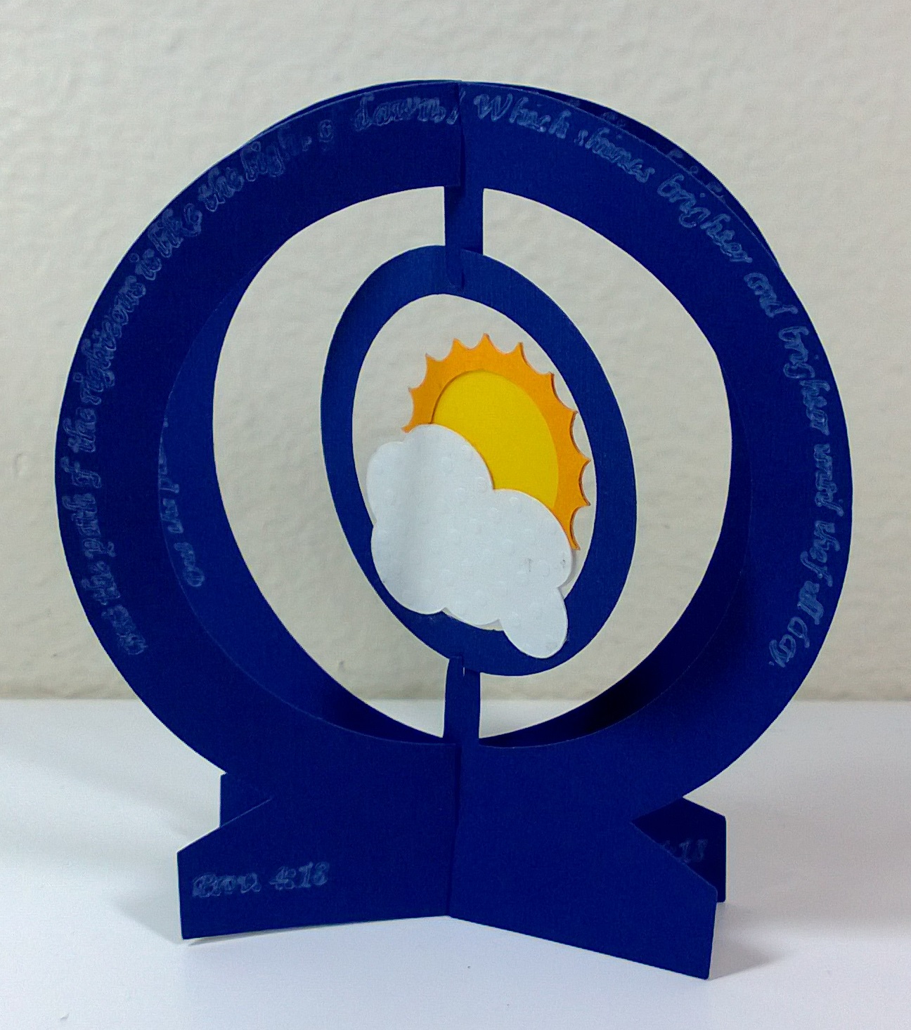
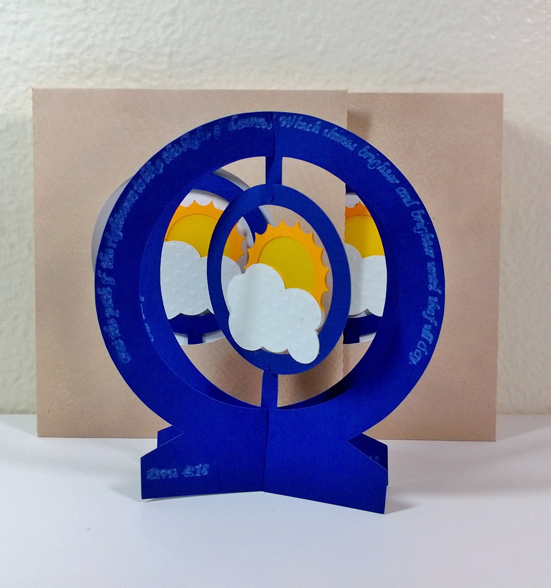 I made this irregular x-form card for a mailing group one of my friends started. She’s an artsy person (I think she studied photography in college) and so I felt like my inaugural contribution to the mailing group should be more than just a letter.
My original plan involved a card and maybe something mustache related, as we both are fond of mustaches on sticks, but it’s been hard controlling my time with all the commuting I do. In the end, I opted for just the card.
I got the idea for this card after seeing this one from Sarabande. I saw that card perusing through the Extreme Cards and Papercrafting site. You know, as one does. I’m pretty sure I’ve mentioned the Extreme site before. It’s a good resource if you’re looking for pop-up card techniques and even some templates.
Anyway, I simplified the card from what you see in the Sarabande card. It was too busy with the ring in extra ring in the middle because my card isn’t really that big. I think the diameter of the outer rings were 3″ with a 0.5″ width. It doesn’t give you that much room to play around in the middle.
Materials:
- blue cardstock
- golden yellow cardstock
- yellow vellum
- textured white cardstock
- white gel pen
- Silhouette machine
Description:
I drew everything in Silhouette Studio (the free version because I haven’t found a really good excuse to pay for the designer edition). The outer circles are circles welded to a trapezoid. I welded rounded rectangles to the inside of one of the circle frames as tabs to hold the inner circle. There are slots cut on the tops and bottoms halfway through the width of the frames so that the bottom of the frame pieces can sit flush against the table. There are slots cut in the tabs to hold the inner circle.
The inner circle is…just a circle. I think I made the outer diameter of the inner circle about 1.5″ with a 0.25″ width. There are slots cut on the top and bottom of the circle to fit the tabs on the frame.
I made the cloud shape by welding a bunch of circles and ellipses together. The sun was made from two concentric circles and then I subtracted half circle pieces out to create the rays. I actually decided halfway through making the card that I wanted to make the sun transparent, but I had already welded my cloud and sun together as one shape. I ended up having Silhouette separate of the enclosed outlines of the cloud/sun shape and I cut them out separately. I had to weld a few tabs onto the sun so I could glue on the rays and also weld some tabs onto the rays to be able to glue it onto the cloud. Obviously I had to cut out mirror images of the cloud shapes and rays to assemble the whole thing.
I made a quick window envelope to display the sun and that was pretty much it. The card can be opened and it stands nicely on the table. The inner circle also flares out a little to give the whole thing some depth.
Oh, you might want to know why I called it the “brighter and brighter card.” Well, aside from the fact that there’s a sun coming out of the clouds. I had a verse and associated song stuck in my head around that time.
But the path of the righteous is like the light of dawn, / Which shines brighter and brighter until the full day.
Prov. 4:18 (RcV)
It’s a rather encouraging verse and some of the people on my mailing list for the month were college students in the midst of finals. I thought maybe they would like a cheery verse and card to bolster their spirits so they could rally through the end of the semester. Or something.
So there you have it. An irregular x-form card.


