Hey look, a real post! And a crafty one at that too.
So, remember when I was talking about cabbages? It’s because I was busy doing cabbage related things. Like this card. That I made for my sister. And her now-husband. For their wedding. Yes, it’s a cabbage wedding card.

Why a cabbage? Because I like them. And it’s been a joke between a few of us with cabbages and wedding dresses. My sister unfortunately did not wear a cabbage wedding dress. Big disappointments all around, guys.
Anyway, I kind of liked how ridiculous this card was. I mean, if you can’t give your sister an absolutely ridiculous card for her wedding, who can you give it to?
The popup people I made looking at generic images of “tada” and making them into silhouettes. I tried to find the most ridiculous poses.
The cabbage,
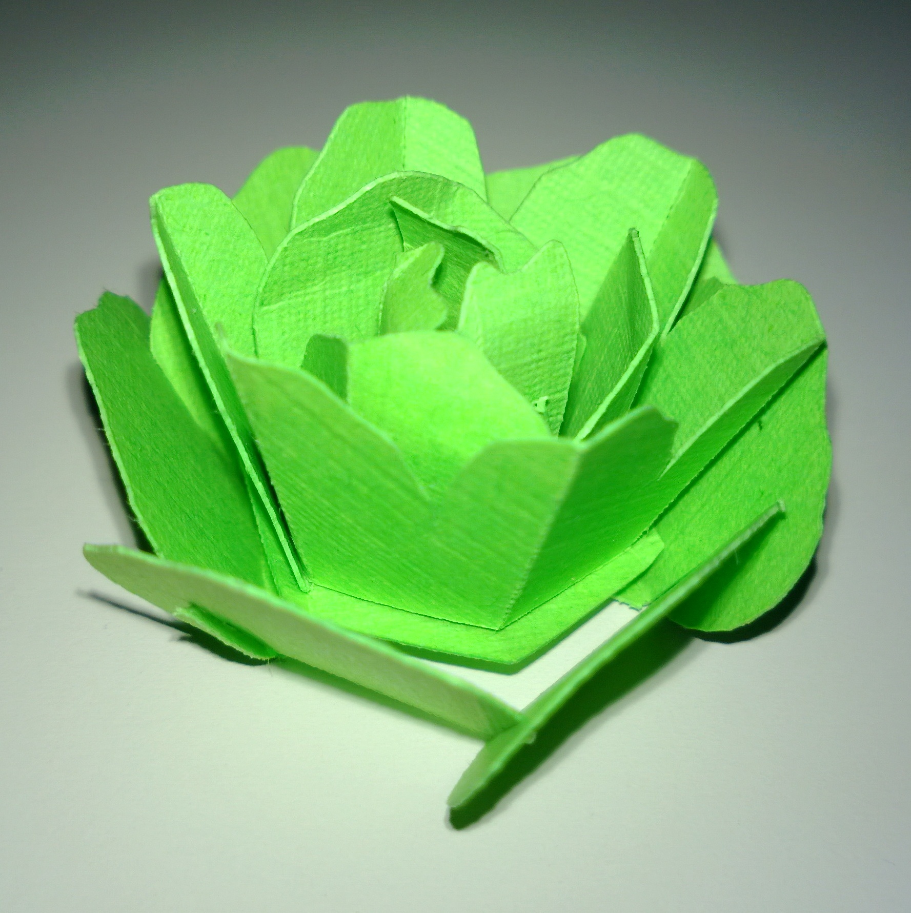 which I’m actually rather proud of, is actually a repurposed rose. Roses look remarkably like cabbages when they’re really small and not in full bloom. I got the rose pattern from Rich over at Creative Popup Cards. It was originally for a mother’s day card. It’s rather impressive looking as a rose. Except that I used it as a cabbage. The difference between assembling a rose and a cabbage is obviously size and color, but also curling the petals in. I didn’t get a really good photo of that. Oh, and I also added veins to the outsides of each leaf using a white gel pen. Also didn’t get a good photo of that.
So, there you have it. A ridiculous, cabbage-themed wedding card. I doubt that anyone else will ever be able to use it. Huzzah!


